Post: Assignment#4
Assignment#4 Clustering and Classifying Images
Part One
How does one built-in algorithm such as Inceptionv3 in ODM cluster the data?
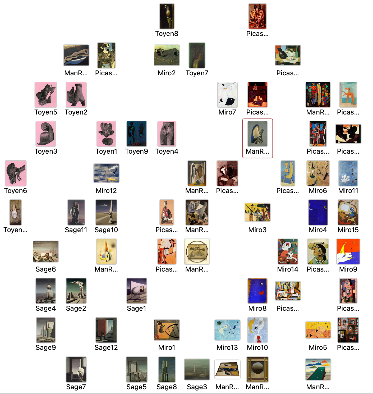 Inception V3, a deep convolutional neural network, is utilized within Orange Data Mining to analyze and cluster image data. This algorithm excels at detecting intricate features in images through layers that learn hierarchical representations. In this specific application, it appears that the algorithm clusters images not only by subtle color gradations but also by visual patterns and compositional elements. For instance, paintings with predominant pink hues are aggregated on the left-hand side of the grid, suggesting a color-based clustering. Similarly, artworks featuring geometric patterns, such as rectangles and circles, are grouped towards the bottom of the grid. This indicates that Inception V3 effectively discerns and clusters based on both color palette and the presence of distinct shapes and structures within the paintings
Do other algorithms give you different results?
 Painters:
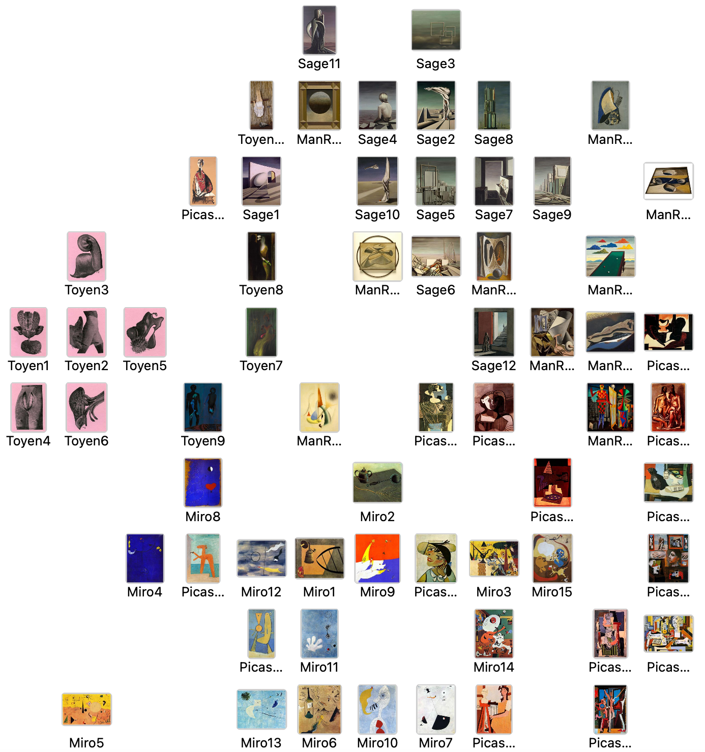
Paintings by the same artist are grouped closely together. This indicates that the painters embedder is effectively capturing stylistic signatures that are unique to each artist. For example, most of Sage’s works are at the top of the frame instead of the bottom now.
What features seem to be most characteristic of the different quadrants of the image plot?
Top:
Characteristics: This quadrant includes a mix of seemingly modern and classical elements, with a focus on structured, often stark compositions. The images, such as those by Sage (Sage11, Sage3), show a penchant for subdued palettes and architectural elements.
Artistic Styles: Sage’s works here, featuring architectural and sculptural elements, are paired with images that maintain a similar structural integrity, suggesting that the embedder values compositional rigor and perhaps thematic gravity.
Right: Characteristics: Dominated by more vividly colored and dynamically composed images. This quadrant blends abstract and surreal elements with a clear presence of human figures and narrative hints. Artistic Styles: The pairing of Man Ray’s explorative, surreal images with Picasso’s vibrant cubist works (e.g., Picasso near the edge) and Sage’s surreal landscapes and scenes (Sage4, Sage2, Sage8) suggests a clustering based on narrative depth mixed with experimental visuals.
Left: Characteristics: This quadrant groups darker, moodier images that often utilize a limited color palette. The focus seems to be on abstract and surreal expression with an emphasis on emotional or evocative content. Artistic Styles: The clustering of Toyen’s deeply surreal artworks (Toyen1, Toyen2, Toyen5) suggests an affinity for darker themes and more introspective or dream-like qualities.
Bottom: Characteristics: Features a mixture of abstract forms and more clear, representational elements. This quadrant is characterized by a balance of color and form, where abstract elements are integrated with recognizable subjects. Artistic Styles: Here, Miró’s vibrant abstracts (Miró2, Miró9, Miró15) are mixed with Picasso’s figurative and abstract pieces, indicating a clustering based on a playful yet thoughtful exploration of form and color.
Using hierarchical clustering, isolate specific clusters to look more closely.
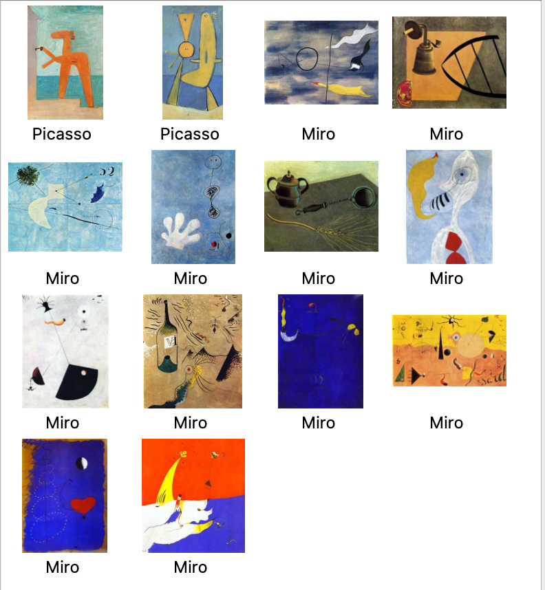
-
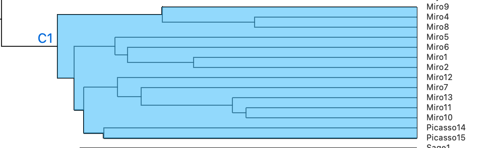
Common Features Across Both Artists’ Works: Abstract Forms: Both artists often employ abstract forms that distill figures and scenes to their essential elements. This simplification can involve both geometric and organic shapes. Color Use: Both Picasso and Miró are known for their vibrant use of color, but they also integrate muted tones effectively within their compositions. The clustering may have identified a similar approach to balancing color palettes. Surreal Influence: Miró’s works are inherently surreal, and while Picasso is primarily known for Cubism, he also explored surrealism, especially in his abstract figurative works.
-
Possible Reasons for Grouping Together: Thematic Similarities: Themes such as the human condition, dreams, and mythology may appear in both artists’ works, providing a deeper level of similarity that the clustering algorithm could pick up on. Innovative Techniques: Both artists experimented with form and perspective, which could make their artworks appear similar through the lens of a clustering algorithm focused on these aspects.
-
Interpretation of Hierarchical Clustering Results: Shared Aesthetic and Conceptual Approaches: The clustering suggests that both artists share a common ground in how they abstract reality to express deeper meanings. Their works might also parallel in how they manipulate space and color to create a sense of depth or flatness, which could be a significant factor in their grouping. Sensitivity of the Clustering Algorithm: This outcome highlights the algorithm’s sensitivity to not just visual similarities but also to the artists’ shared approaches to abstraction and surrealism. This can be particularly insightful in studies where cross-artist themes and influences are of interest.

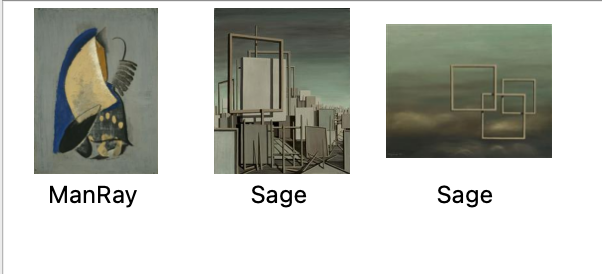
-
All three paintings prominently feature geometric shapes and structures. Man Ray’s painting integrates these elements in a more surreal, organic context, while Sage’s paintings focus on structured, almost architectural settings and surreal landscapes. The use of lines and structured forms is quite evident, creating a sense of space and depth that plays with the viewer’s perception.
-
Surreal and Abstract Themes: Each artwork incorporates a surreal quality that distorts reality in a subtle yet impactful way. This surrealism isn’t flamboyant but rather integrated into the structure of everyday objects and spaces, making the ordinary appear unfamiliar. The abstract qualities in these works suggest a departure from realistic depiction, favoring instead an exploration of form and the interplay of reality with imaginative constructs.
-
Muted and Harmonious Color Palettes: The color schemes in all three artworks are subdued and harmonious, relying on a limited palette to enhance the compositions without overwhelming the geometric and surreal themes. This use of color supports the structural elements rather than taking a forefront position, which ties the pieces together in a visual and thematic narrative.
Part two
How well did any of the built-in algorithms you chose predict the categories you established?
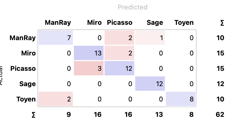
- High Accuracy for Some Artists: The classifier performs very well for Miró, Picasso, and Sage, with high true positive rates, indicating that it can effectively recognize and differentiate their styles.
- Common Misclassifications:
ManRay and Toyen: There are confusions between ManRay and other artists like Picasso and Sage, and Toyen is sometimes confused with ManRay. This could suggest some stylistic similarities in certain works or a challenge for the model in distinguishing unique features of these artists.
Picasso Misclassifications: Picasso is sometimes misclassified as ManRay, which could indicate overlapping features or styles in certain paintings that the model finds confusing.
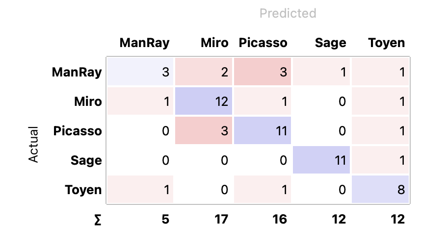
- The performance of Inception V3 is mixed compared to the painting embedder. It shows a drop in accuracy for Picasso and Sage, suggesting that while it might handle some artists better, it does not universally improve classification across all artists.
- Misclassification Patterns: Man Ray and Picasso: A notable amount of Man Ray’s work is misclassified as Picasso’s, which could indicate overlapping features in their styles or abstraction techniques that confuse the model. Sage and Toyen: The minimal misclassifications between Sage and Toyen suggest that while they are generally well-classified, there may be occasional overlaps in style or thematic elements that are not as distinct to the model.
- Overall Model Performance: The model performs very well for artists like Sage and Miró, who have relatively high accuracy, but struggles more with Man Ray. This variation in performance might be due to the inherent differences in the artists’ styles or the characteristics of the artworks sampled for each artist.
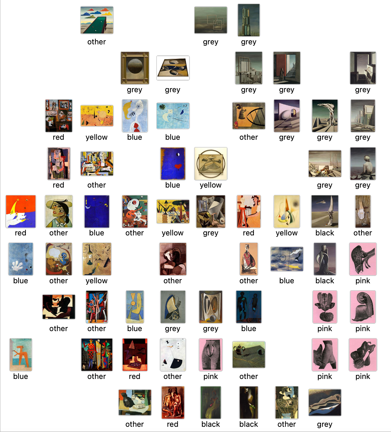
- Consistency and Accuracy in Color Detection:
- Greys: Images labeled as grey generally show a dominant presence of grey or subdued tones. This indicates that the algorithm effectively identifies and categorizes images where grey tones are prevalent, which often correspond to images with metallic, urban, or shadowed elements.
- Blues and Reds: The categorization of blues and reds shows a strong consistency, with images prominently featuring these colors correctly labeled. This suggests good model accuracy in recognizing vibrant and distinct colors which are easier to distinguish.
- Yellows: Yellow-labeled images seem to capture the essence of the color well, highlighting artworks where yellow plays a significant role either in brightness or as a focal element.
- Challenges and Ambiguities:
- Pink and Black: These categories seem less populated and may represent challenges in the model’s ability to distinctly recognize these colors when they are less dominant or mixed with other hues.
- Other: This category is quite diverse, suggesting it includes images where no single color dominates or the dominant color does not fit neatly into the other predefined categories. It seems to serve as a catch-all for complex images, which could be problematic if looking for more granular insights.
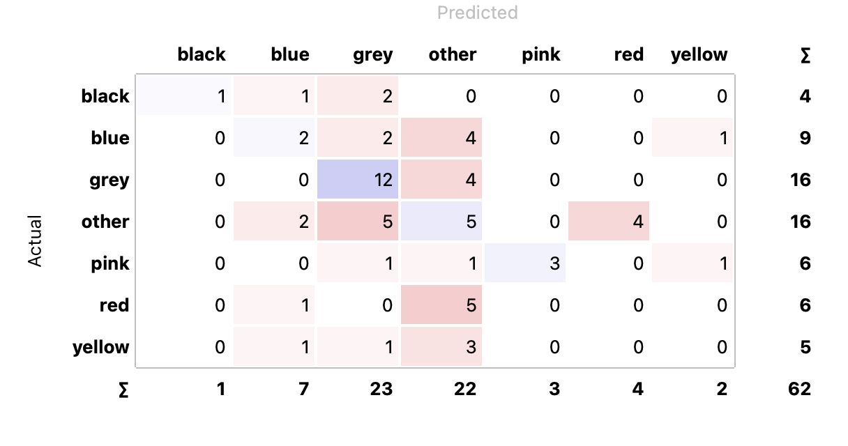
- High Accuracy for Grey: Grey has the highest number of correct predictions, indicating that the model is effective at recognizing and classifying grey tones.
- Significant Confusion with ‘Other’: The ‘Other’ category has a high degree of misclassification, both from and to other categories. This suggests that ‘Other’ is either too broad or that its defining characteristics are not well understood by the model.
- Challenges with Less Represented Colors: Black, blue, pink, red, and yellow show relatively high rates of misclassification. This might be due to fewer training samples or the model’s difficulty in distinguishing these colors within the context of artwork.
If you could train your own algorithm what would you aim to teach it?
-
Enhancing the model’s ability to distinguish between closely related or poorly represented colors could improve accuracy. This might involve training with a more balanced dataset where each color is equally represented.
-
Refining the color categories or perhaps defining them in a more nuanced way could also help, especially for categories like ‘Other’, which appears too ambiguous.
Ready for grading